Intersecting angles
Three women’s sure-handed approach, love of Sawtell and professional flair converges within an workspace design that’s becoming a talking point of First Avenue
When commercial design does its job well, it seamlessly merges the meaningful, the practical and the X-factor. That’s exactly what Therese Ryan and Lyn Rovere wanted for their new business workplace.
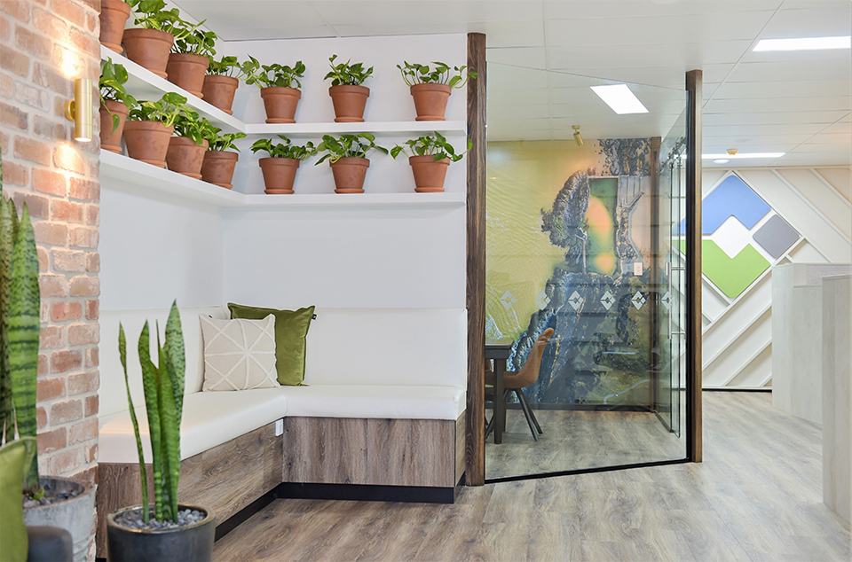
Visitors entering their Cornerstone Conveyancing premises, at the new Rockpool building in Sawtell’s main strip, are met with striking angles, coastal chalky whites and greys, rugged recycled brick, elegant glass, and the splashes of azure blues and greens of Sawtell’s ocean pool.
Until a month ago Therese and Lyn, the business partners behind Cornerstone, had been serving their impressive state-wide client list from Therese’s home office for five years. After growing their team to four and spilling into every available corner of the house, it was time for a move and a refit into permanent premises.
The pair were keen for an open-plan workspace that would convey the credibility and trust that comes with the 60 years’ conveyancing experience between them, as well as their deep love of Sawtell and their dedication to their clients.
Not to mention practical solutions for managing a workflow process that involves merging the talents of team members, confidential high-stakes conversations and juggling 15 files at a time on their desks on any given day.
Enter Lisa Daniel, interior designer from the Design Cupboard. “I'd seen some of Lisa’s work in the fit-out at Silvio’s, and I'd previously dealt with numerous local designers,” said Lyn. “Lisa had a real point of difference. She’s local, but being from Melbourne she had an edge to her work that we love.
“We had a clear brief but also wanted a design that would push us out of our comfort zone. It’s nice to be challenged, be a step above everyone else – and to be a talking point. We instantly felt comfortable that Lisa understood all this and could take us there.”
For the pivot point of the entire design, Lisa used the company logo – a geometric intersection of three colours representing the aspects of Cornerstone Conveyancing’s client work across NSW: blue representing the coast, green representing rural and stone representing the urban and corporate.
Having come from years of visually dry, regimented, and conservative legal working environments, Therese and Lyn were keen to shake things up a little. “Their brief was that they wanted it relaxed, they wanted it to reflect Sawtell and they wanted it inclusive,” said Lisa.
“I looked at that, and their logo, and decided to combine them. That’s why there's nothing that's really symmetrical in the office – it's all based on angles. The workstations are all on angles; the angled zones of the meeting areas; the geometric angles in the feature walls.”
The clever use of angles also creates different zones within the 100 sq m office space. Each zone serves essential functions, such as a relaxed reception and greeting area, a large table and banquette that encourage conversation with clients, and a glassed-off private conference room for reviewing contracts.
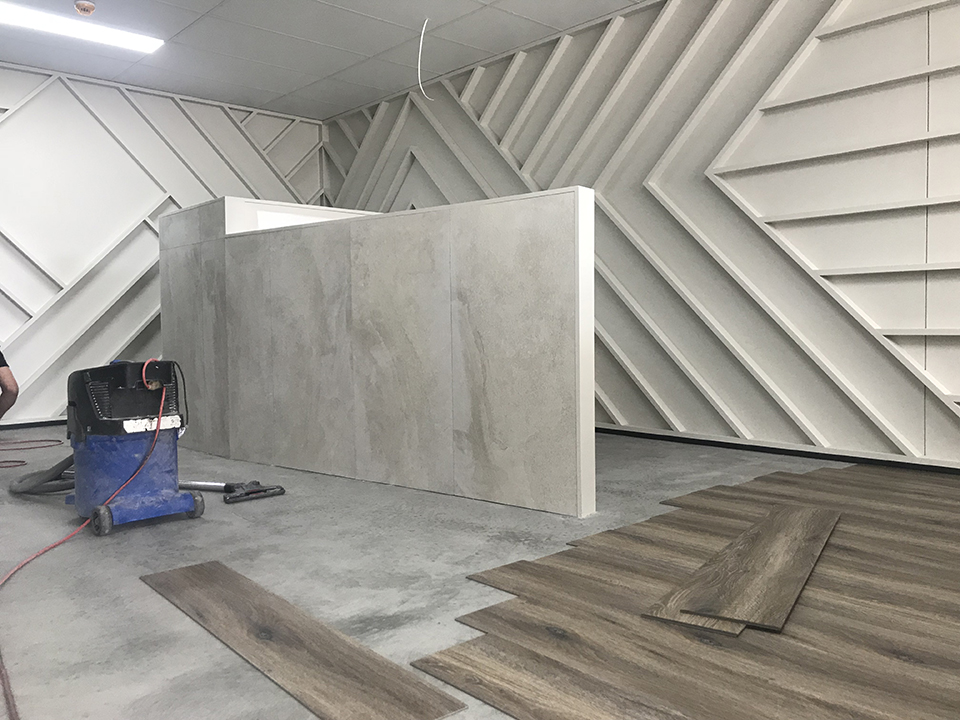
With a timber floor, brick walls and lots of glass, getting acoustics right was critical to the design’s success. Lisa’s solution is both effective and visually striking – a feature wall with timber details running in angled, geometric designs that steer together to meet around the logo.
“With hard surfaces noise will bounce off, that's what can make all those distracting and annoying echoes in commercial spaces,” says Lisa. “Like acoustic panels, the pockets created by all those small beams in geometric feature wall absorb the sound, as well as looking cool and highlighting the logo.”
The feature wall also tackles another practical problem, by housing a bespoke system to store the women’s many working paper files and folders, through elegant storage built flush into the wall.
Another talking point is an eye-popping wall-to-ceiling photo of Sawtell’s historic rockpool within the conference room, shot by Lisa’s photographer husband Elliot Daniel from a drone, and instantly visible to visitors.
“Lisa really gave us a wow factor with that one,” says Therese. “Clients resonate with it, especially when they’re local. It's a good talking point and icebreaker, particularly if a client is feeling a bit uncomfortable, it's somewhere that we can draw their mind.”
With her strong dedication to employ only local craftsmen and suppliers where possible, Lisa hired Holly Adamson from Tres Collective for the interior logo sign and cut-out hanging street signage, Craig Brown from Sapphire Interiors for custom-made tables, Phill George from G4 builders for the fit-out.
Therese and Lyn said the space hasn’t just changed the way they feel about their work, it’s transformative for clients, too.
“Conveyancing is a very stressful time in people’s lives,” said Therese. “A home is usually people’s biggest asset, and there's a lot of money at stake so it's very important that when they enter that door that they feel safe and comfortable.
“We’re very much about raising the bar a for conveyancing on the coast, and conveyancing as a profession.
“I think coupled with the office space Lisa’s created, along with our experience and personalities, clients genuinely feel they're in good hands when they walk in to see us.”
—
Find out more about our Commercial Design Services in Coffs Harbour here.


